Website Updates
Mar 07, 2020
Every once in a while, I get into this productivity slump where I don’t write code for weeks, and it gets hard to get back into the rhythm of working again. For me, the easiest way out of it is to redesign this website. It’s low-effort (relatively), gets some creative juices flowing and has little risk of not panning out ultimately.
And I guess it kinda worked. I spent two whole days on the redesign, and am pretty pleased with the results. Documenting the major decisions I took this time around in this post.
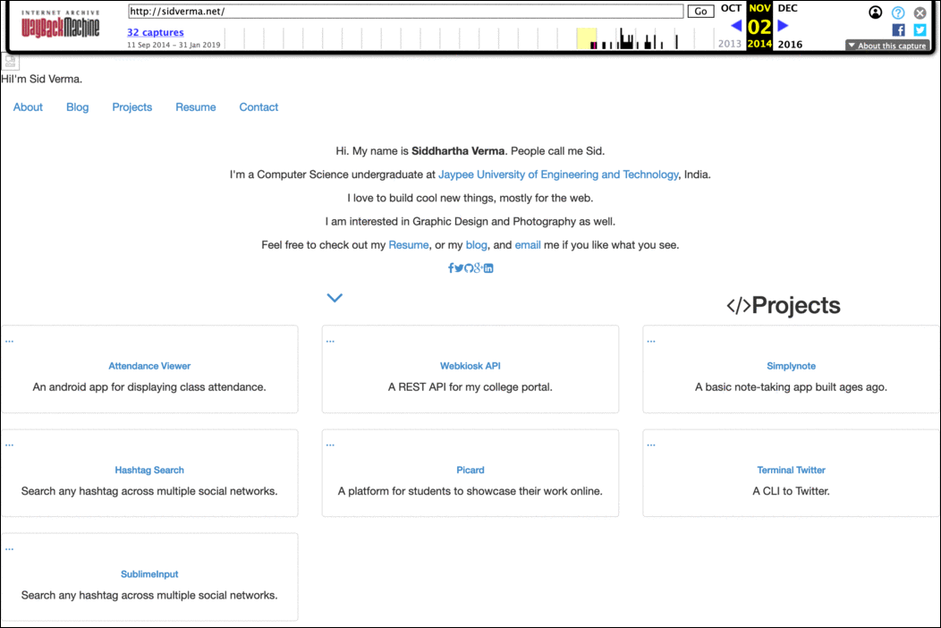
This page (in spirit, anyway) throughout the years
Switching from Jekyll to Hugo
The previous version of this blog was built using Jekyll, with a modified Lanyon theme(I added support for photo albums to it). But I was slowly getting tired of Jekyll, where it was getting in the way more often than facilitating things. Perhaps the only reason I was using it was because Github Pages supported building Jekyll projects by default, and I didn’t wanna run a CI server just for this. And I like not having to build and push the compiled HTML myself, as it removes some of the environment flexibility that I enjoy.
This time I went with Hugo to generate the blog, and am definitely more comfortable in it than with Jekyll. Quick rundown of differences I encountered:
- Hugo is a magnitudes faster than Jekyll when building websites
- Hugo is written in golang, which I’m very comfortable with (unlike Jekyll’s ruby), so I can browse through the code and patch bugs myself
- Hugo has better built-ins like support for image manipulation, third-party markup shortcuts, etc
- Hugo has a better directory structure than Jekyll, imo
- Hugo has as better documentation than Jekyll, but is still hard to browse. Almost every documentation should have a ‘References’ section where you can find every function of every type in a single webpage. Hugo doesn’t have that.
- Hugo’s templating language is slightly worse than Jekyll’s liquid syntax though. Liquid feels more explicit, and has saner scoping of variables than Hugo’s.
- Hugo is relatively newer and hence, doesn’t have a very mature API. I often needed to do iffy hacks to get some things done (simple things like getting the current url in a paginated page)
As for generating and hosting the blog, I am sticking with Github Pages behind Cloudflare SSL for now, while using Github Actions to generate the final HTML from source. With those 2,000 free minutes per month, and how quick Hugo is, that’s almost 2,000 times I can compile this blog every month for free.
The theme
Switching from Jekyll to Hugo didn’t take a lot of time. They both take markdown files as a source, so it was just moving and renaming those files with some minor templating changes for Hugo’s Goldmark renderer.
Most of the time was spending on writing the website template, where I reconsidered all the extra standard junk content one puts in for SEO and general fanciness. Over the last few year, I’ve had a growing disdain for how complex and heavy simple webpages have become, with not much need or demand to do so. I really wanted to keep this theme very low on resources, and work perfectly with the simple lynx browser.
This theme is built from the ground-up without any frameworks. It also has:
- No excess of
<meta>tags. Just the one to define the viewport for mobile devices. Search engines stopped caring much about your keywords and description tags long ago with SEO shops propping up on every corner of the street.- No
og:ortwitter:meta tags either. Most social networks would pick up the title and an excerpt from the page itself. Twitter doesn’t, but I’m okay with that. That’s twitter’s decision, and I am not comfortable with adding tags to “attract attention” to a tweet.
- No
- No heavy
apple-touch-iconimages. For some reason, browsers do load the image without needing to. If it’s not a web-app which someone would pin to their homescreen, that tag is almost unnecessary, and just additional weight. - No essential javascript. I am not anti-javascript, but I do like to browse the web with javascript disabled by default. Most tracking, ads, popups and floating ‘SUBSCRIBE TO OUR NEWSLETTER NOW PLEASE’ banners go away without javascript.
- The only javascript I have is for a fancy Email link in the footer and on the homepage. If you click on that link, the text changes to display my email-id (with a standard mailto: link). If you have javascript disabled, it redirects the user to the Contact page which has my email. Also, the email is loaded in the webpage as base64 encoded string, so simple bots shouldn’t be able to extract it and spam you. The reason for this is in the last point here.
- Minimal
@mediaCSS rules. This keeps the style simpler and smaller. This webpage was responsive without those 9 lines of media queries, but I chose to decrease the font size a bit for tiny devices. Usingemas the unit in most of the stylesheet changes margins and paddings proportionally for the rest of the page. - No external fonts. System fonts are good enough on most devices. And a user is very used to seeing them everywhere anyway, so it’s less of a jarring experience.
- Unicode symbols instead of Font Awesome symbols. Font Awesome is pretty nice, but I didn’t feel the huge need to load external font-files or glyphs to display a tiny amount of basic symbols. Unicode has a lot of characters available, and even more as emojis. The “tag” icon at the bottom of the post is
U+1F3F7. The left angle on this webpage’s top-left corner isU+2039. For more complex shapes, I’m gonna still look at inline SVG symbols and CSS magic until I start getting diminishing returns. Also, writing ‘Github’ instead of displaying the Github logo can be cleaner. - Minimal chrome. The website title stays in a corner, slightly smaller than the article title. From then on, front and center is the blog title, the date, and the content. The footer includes the ‘about’ content, which is displayed only on blog posts and not on any other page, except on the top of the homepage, well, because it is the homepage.
- No trackers. I don’t really need analytics on this personal blog, and not a lot of people do. So, enjoy a little more private web while you’re here.
The main goal of this theme was to design what I would personally like to browse on, rather than try to get the highest retention and the lowest bounce rates by using increasingly complex and heavy assets. As of writing this, the homepage of this website is 6.60 KB gzipped. If you want to test this out, the hugo theme is called Rocinante and is available here.